
One of the most common questions that comes up on every auto modeling forum is about color. Like most modelers, those of us who build cars – and in the case of GPMA, race cars in particular – we can get obsessed about getting the color and hue just right, and as historically accurate as we can make it. Unfortunately, if we enjoy vintage racing, all we have to go on might be black and white photos. Or if we’re lucky, we might find some old or faded color pictures. Neither of these are much help if we’re looking for that perfect color for a historic subject.
In the days before sponsorship, cars were typically painted in national racing colors (see the National Racing Colors shown at the bottom of this page). Even these were open to interpretation, though. For example, you would expect British Racing Green to be the traditional dark green made popular by Jaguar, but you might be surprised to learn that other marques such as Aston Martin, BRM, and others used different shades, ranging from very pale, light greens to the well known dark colors.
But there are always certain colors that seem to crop up from time to time. Let’s examine a few of them. (Thanks to members of the GPMA forum for their comments.)
Oranges
There are a couple famous marques or cars that were painted in shades of orange. The most common discussions center around two of them.
Jagermeister Orange
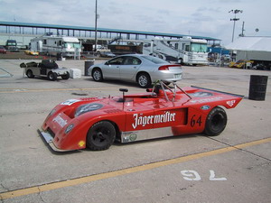 Jagermeister has sponsored a number of well-known race cars through the years. Some modelers have even built a whole series of cars that were backed by the company. So, what’s the consensus on the right color for a Jagermeister sponsored car? Gil Mann, back in 2004, had this to say:
“The color mandated in kits of Scala 43/Competition 43, who make a large number of Jagermeister subjects, is RAL2004. This is a European or International code that is not used much in the US. A builder whose opinion I respect had his paint shop match it and came up with Mercedes Truck Rhine Orange, Dupont #46259.”
Alternatively, Dale King suggests:
“I’ve found that Fruehauf truck orange (a fleet color) seems to be “just right. I’ve been using this same color for some 20+ years now. When I could no longer get it in automotive lacquer (lacquer has been basically outlawed in California) I had MCW custom mix it for me from a paint sample I sent to him. I’ve used this color on everything from 12th to 43rd scale. Maybe he has the formula or at least my color sample still on file.”
McLaren Orange
During the 1960’s and ’70’s McLaren was known for its bright-orange Can-Am and Formula 1 cars. They are popular subjects for models, and the question of their proper color comes up quite frequently.
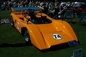 Mike Stucker likes to use Tamiya TS-56 “Brilliant Orange:”
“That’s the color I’ve used on all my Marsh McLaren models. You can see what the paint looks like on the finished models if you go to the model section of my web site at: http://www.vintagerpm.com/can-am_models.htm
The different cars were shot in different lighting conditions, so you will see several permutations of what the orange will look like. Its one of the reasons I like the paint for McLaren Orange: it seems to go from orange to yellow in different light just as the paint on the real cars did.”
If you can’t find a can of the Tamiya spray, Tom Hiett had this suggestion:
“Butterfinger orange is really, really close. New wrappers have a couple tints and green leaves that makes it a bit harder. I’m told places that sell auto paint usually have commercial fleet color codes going back to the 20s and somewhere in there is probably a truck color for Butterfinger candy bars. Otherwise, MCW has a McLaren orange.”
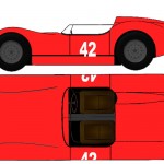
Reds
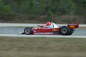
If I had to guess, I’d say that Ferrari Red has led to the most discussions about proper paint color. Ferrari red was a national color that over time became a corporate color. The 21st century Ferrari color for F1 cars is called “Rosso Scuderia,” and is also available as a production paint color. It’s a bright red-orange that shows up very well on television and in print. In the 80’s and 90’s it was a darker red known as “Rosso Corsa.”
 |
 |
If you can’t find or don’t want to go to the trouble or expense of a custom mix, Charles Fox suggests you can get a good match using this technique:
“The hot setup with Ferrari red in Tamiya is: (1) Tamiya white primer (over whatever primer you’ve used — not polished to death, but left with a bit of “tooth”, (2) Tamiya pink over that, again smoothed but not excessively, and finally (3) red. Smooth that reasonably, cover with clear, and polish that to your heart’s content (so you’re polishing clear and not color).”
Classic Ferrari red is a very different matter. Moving into the 70’s or earlier, Ferrari Red was just “red.” Any color that looked close was adequate. There are even stories of the Ferrari “works” team buying spray cans of red paint from Montgomery Ward’s department store when racing at Daytona in the early 1970’s.
Randy Enerson made this point about the classic Ferrari Reds:
“On color – unless you have access to a time machine and bring a paint chip card with you, a Ferrari red would still be ‘red’. It might be a little lighter or a little darker depending on the supply in the workshop at the time. But whether it is for covering the floor or the walls, it will make no difference at all on your model. The whole point of this discussion is rather pointless. Unless you paint a ‘classic’ Ferrari day-glo orange of course, no one could say that the color on your ‘sharknose’ or whatever doesn’t exactly match Humbrol 19… No need to supercomplicate matters!”
So, in general, any red that “looks right” would be correct for a classic Ferrari. The same would go for a classic Alfa Romeo or Maserati, though those marques tended to have darker reds, almost maroons.
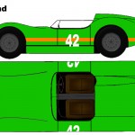
Greens
When you refer to green in racing, the first color that will come to most folks’ minds is British Racing Green (BRG). Interestingly, this is actually usually Jaguar Racing Green. It’s a very dark non-metallic green. However, BRG does not necessarily have to be a dark green. It just has to be green. The international specification didn’t indicate light, dark, metallic, or non-metallic.
Fielden Lundy put it this way: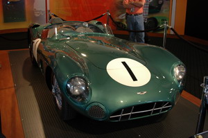
“British Racing Green has/had many hues. From the UDT/Laystall pale lime green, through the Lotus bright green to the BRM metallic blue/green to the Cooper dark blueish green.
I saw the team cars race in the late sixties, and they were definitely green. Dark, mind you, and with a lot of blue in the mix, but definitely green. If you look at a faithful color picture of the 59-60 factory Coopers when Brabham was driving, they were green. Or look at one of the restored cars running today.”
Scott Truesdell has an interesting theory on where that “classic” BRG might have came from:
 “I have a theory about British Racing Green: I had decanted some of Tamiya’s “Racing Green” spray to use with an airbrush. I have (or at one time had) a gross of 1 ounce scintillation jars into which I decant. So after setting on the shelf for a month or two, the BRG separated into a veritable rainbow of colors: 40% transparent blue, 30% dark gray/olive, 20% green, 10% iron oxide.
Surplus paint left over from WWII? Just mixed together and sold cheap?”
If you’re looking for a reasonable match for the classic BRG, check out Tamiya’s TS-9 “British Green,” or order a bottle from Model Car World Paints.
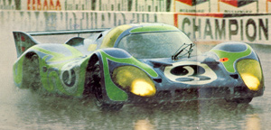
Burple
Another of the frequently asked questions is about the 917 “Hippy” cars. These cars were painted in what is commonly referred to as “Burple” – a cross between blue and purple. And since these cars ran in the early 1970’s, photos of the cars can’t really be relied upon as accurate references due to the age of the images. Even people who were actually at the races where this car appeared can be conflicted about what color is “right.”
Mark Lavender had this to say:
“You tell me! I stood next to the bleeding car, in good sunlight and still don’t know what the colour is!”
Chris Clark added this:
“I even asked David Piper who runs the car today, if he had a paint match or code for the colour and even he didn’t know. So what chance have we got ?”
That said, some recommend Tamiya TS-57 “Blue Violet” for the Watkins Glen car. Note that there were two “Hippy” cars, one of which was burple and the other was a real blue.
 |
 |
Kevin Stuart agrees:
“Both cars were blue and green, or more specifically, violet and green. Trying to define the color violet is difficult, as it seems to span a range of pale blue to deep “almost purple” blue. Looking at these cars in their blue-green livery also creates a kind of optical illusion, where the blue takes on a more purplish cast.”
Model Car World also makes a match for the burple car in lacquer. Bottom line on this is, get it close and nobody can really argue the point.
Scale Effect
Finally, no discussion of paint would be complete without mentioning scale effect. In short, scale effect is a belief that our perception of color changes depending on distance, so logically if we were to build in 1/12 scale the “scale effect” on the color would be different for someone building the car in 1/43. Others dispute the concept, saying color is color, no matter where it might be. Both camps have valid points.
Scott Truesdell sums it up nicely:
The scale color effect is real.
Ask anyone who picked a color for their house from color chips and when they started painting were horrified to see how oversaturated the color appeared in massive quantities.
It’s almost as if your eyes “drink” the color: one shot, no problem; 12 shots and it’s “Whew – That’s some strong stuff!”
With models it’s almost the reverse. What I try to scale is atmospheric haze. Using the exact color looks exactly right if you view it from a 1:1 viewing distance, but if you view at a “model examination” distance the color looks too bright. The scale aircraft and armor guys have been on to this for a while.
The oversaturated effect is exaggerated at certain (wavelengths) colors. One of the trickiest for me is the scale Gulf blue which, due to its wavelength being so close to sky blue, almost always looks too blue close up, even on real cars. I look at a Gulf Ford GT or Porsche 917 in the paddock and think that restorers got it too blue, then I see the same car from 300 meters away on the track and it looks just right.
And don’t even get started on the multiple pigment colors like “burple” which seem to dramatically shift color depending on the weather.
So … I’m just talking here. There is no answer. In Tamiya’s book he talks about tweaking proportions to match 1:1 perceptions. The subject is endlessly debatable. But in the end, I consider building these models (as opposed to actual design prototypes) to be “art” and, as an artist, I’ll build it so it looks good to me.
As do we all.
Contributors: Gil Mann, Dale King, Mike Stucker, Tom Hiett, Charles Fox, Randy Enerson, Fielden Lundy, Scott Truesdell, Mark Lavender, Chris Clark. All images Copyright ©2006 Michael Hanson.
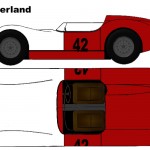
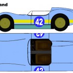
International Racing Colors Gallery
-
- Argentina
-
- Australia
-
- Austria
-
- Belgium
-
- Brazil
-
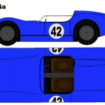
- Bulgaria
-
- Canada
-
- Chile
-
- Cuba
-
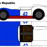
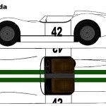
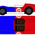
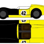
- Czech Republic
-
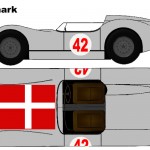
- Denmark
-
- Egypt
-
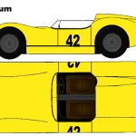
- Finland
-
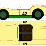
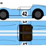
- France
-
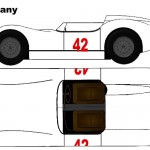
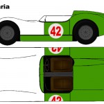
- Germany
-
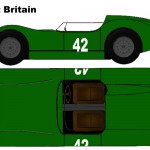
- Great Britain
-
- Greece
-
- Hungary
-
- Ireland
-
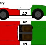
- Italy
-
- Japan
-
- Jordan
-
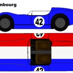
- Luxembourg
-
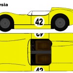
- Malaysia
-
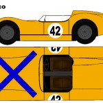
- Mexico
-
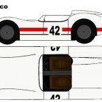
- Monaco
-
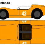
- Netherlands
-
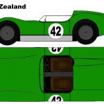
- New Zealand
-
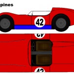
- Philippines
-
- Poland
-
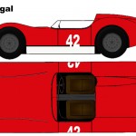
- Portugal
-
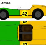
- South Africa
-
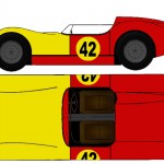
- Spain
-
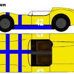
- Sweden
-
- Switzerland
-
- Thailand
-
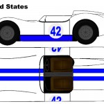
- United States
-
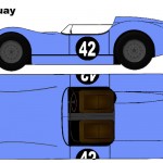
- Uruguay
-
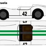
- Venezuela